1. Set The Tone at The Front Door

If you want your house to make a great first impression, paint the front door a fun, glossy hue. A red door meant “welcome” to weary travelers in early America, and on churches it represents a safe haven. Two other hues gaining favor: orange and yellow, according to San Francisco-based stager Christopher Breining. Both colors are associated with joy and warmth. One thing that should go: an outdated screen door. Get rid of it or replace it with a storm door with full-length glass that you can switch out for a screened panel.
2. Keep Wall Colors Light and Neutral

Stick to colors like beige or gray, especially on the first floor, where flow is important. Neutral walls give you the greatest decorating flexibility, allowing you to easily switch up your accessories. And if you have two small rooms next to each other, painting them the same neutral color helps them feel larger.
3. Make Sure Your Sofa Talks to Your Chairs
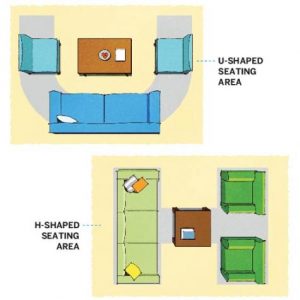
The furniture is arranged in groupings that invite conversation. When you place the furniture in your living room, aim for a similar sense of balance and intimacy. “A conversation area that has a U-shape, with a sofa and two chairs facing each other at each end of the coffee table, or an H-shape, with a sofa directly across from two chairs and a coffee table in the middle, is ideal,” One common mistake to avoid: Pushing all the furniture against the walls. “People do that because they think it will make their room look bigger, but in reality, floating the furniture away from the walls makes the room feel larger,”
4. Let The Sun Shine In

“When it comes to heavy, outdated drapes, a naked bank of windows is better than an ugly one,” Ideally, window dressings should be functional and elegant: Think sheers paired with full-length panels. If your room gets a lot of sun, opt for light colors that won’t fade. The most recommended lightweight fabrics for panels are cotton, linen, and silk blends because they tend to hang well. .
5. Scale Artwork to Your Wall

“There are few things more ridiculous-looking than hanging dinky little art too high on the wall,” The middle of a picture should hang at eye level. If one person is short and the other tall, average their heights. Also take scale into account; for a large wall, go big with one oversize piece or group smaller pieces gallery-style. For the latter, don’t space the pictures too far apart; 2 to 4 inches between items usually looks best.
Post Your Comments