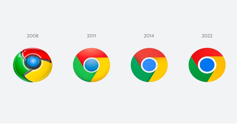
Google Chrome is altering its logo for the first time since 2014. Google Chrome designer Elvin Hu shared the first glimpse of the redesigned logo on Twitter.
Sharing the design, he added, ‘We’re refreshing Chrome’s brand icons for the first time in 8 years. The new icons will start to appear across your devices soon’.
The three colours of the new logo – red, yellow, and green – are flat and have no shadow. Furthermore, the blue circle in the centre appears to be larger and brighter.
Elvin further said on Twitter that putting certain colours of green and red adjacent to each other produced an unpleasant colour vibration. As a result, the team applied a modest gradient to the primary symbol. The team has also built OS-specific customizations, which means the logo will be more colourful to match the other system icons, but it will have a slight shadow on macOS.
Also Read: Veteran actor Anupam Kher shares Lata Ji’s last audio message for India
Elvin explained the rationale for the change. He said, ‘You might ask, why bother with sth. so subtle? We tailor Chrome’s experience to each OS, with features like Native Window Occlusion on Windows, day-one M1 support on macOS, Widgets on iOS/Android, and Material You on Android. We want our brand to convey the same level of care’.
https://twitter.com/elvin_not_11/status/1489647027789000714?s=20&t=5tZATkDgmZ7qGuQ0CzGeEA
The new design caused a flurry of opinions on social media, with many people claiming that the difference between the old and new logos is insignificant.
#GoogleChrome New logo. Spot the difference ?
2014 2022 pic.twitter.com/lJXL7zqgjs
— Sonu Prajapati (@TechMumbaikar) February 6, 2022
After seeing the Google chrome logo change: pic.twitter.com/or6xEP1fq3
— Goggle Wala Memer (@GoggleWalaMemer) February 6, 2022

Post Your Comments