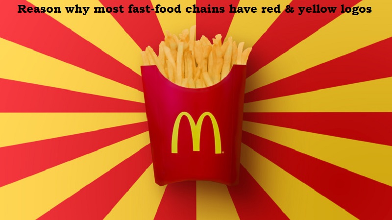
Most of the fast food chains have the same shade of yellow and red in their logos, and marketing experts say there’s a very good psychological reason for that. Read on to find out why.
Increases the appetite
The fundamental rationale for these colour selections is that when we see these two colours together, we have a tendency to crave. People tend to eat more at fast food restaurants than they would otherwise because it enhances their appetite. Not only that, but this hypothesis is supported by actual psychology.
The psychology of colour
The colour yellow has long been linked to feelings of satisfaction, joy, competence and comfort, according to colour psychology. Every time you walk by those golden arches, you feel a sense of friendship and nostalgia brought simply with just one simple colour.
Red, on the other hand, symbolises passion, strength and love. Because of this, when yellow is present, a person may find themselves suddenly craving a cup of perfectly cooked, golden fries.
It’s been said that yellow logos boost metabolism, whereas red logos can make individuals feel hungry.
The scientific reason
Red is the colour that is associated with activity and can raise our heart rates, according to scientists. Your heart rate and appetite are both elevated when you look at this colour. While happiness is linked to the colour yellow.
Red makes you hungry while yellow makes you feel happy, which encourages you to buy food, even when you are not hungry.
Post Your Comments