The logos of famous companies that we subscribe to are so imprinted upon our memory that we will recognise it even in a half sober state. But do you know that even some of the top companies’ logos are not devoid of mistakes and hold some secrets ? Read all about it here.
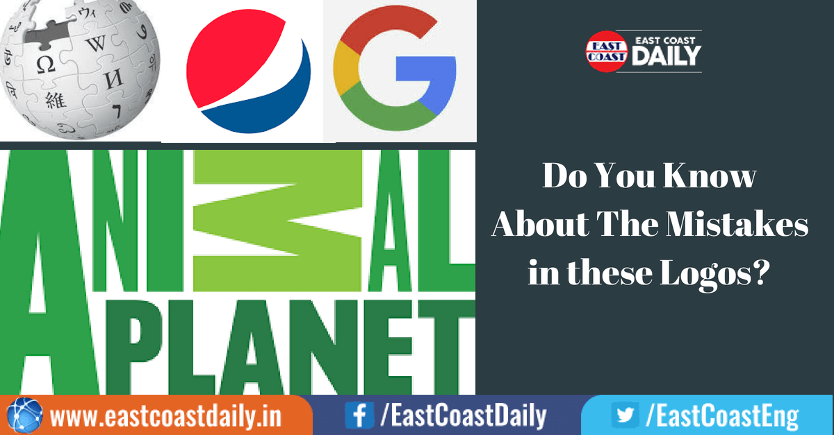
WIKIPEDIA
Endless source of Knowledge accessible from anyone around the world, Wikipedia is exactly trying to convey the same idea through its logo. The little puzzle pieces on the globe have different languages on them, they also convey that people from any language can contribute to the knowledge base of Wikipedia. But then you notice this Chinese character, which had a big mistake in it. You wouldn’t know it unless you know Chinese, so let us tell you what went wrong.
In Chinese language, every stroke in a character would completely change its meaning and make it gibberish. The logo designer wanted to write the word ‘WI’ but one attachment made it JIE and not WI. The logo creator said not all the logos are meant to stand for something, but they finally decided to replace the troublesome Chinese character with something entirely new.
see also: Shocking! This Man Showed that You Can Use ‘Ok Google’ Command to Fire a Gun. Watch Video
ANIMAL PLANET
 A Few years ago, the channel lost its globe and elephant symbolism for a customised font spelling the TV Channel’s name. They put the M letter sideways which only added to the confusion of viewers making it almost look like an algebraic character. But Animal Planets representatives never changed this logo, probably because Content is the King and not the logo.
PEPSI
Pepsi’s logo including three colours have changed a lot over the time. The symmetry of the three colours have changed, the proportion between three colours have changed but that’s not the point here. We all know how carbonated drinks can contribute to over weight. Pepsi’s current logo can show you how this is possible with a few strokes.
See ? Funny isn’t it.
 We rely on Google every time to make sure we don’t commit mistakes. Google helps you put in touch with its endless resources that has answers to pretty much any question in the world. Google has a simple logo but there is one small problem with its logo design. See the G ? The letter G is not forming a complete circle it should be, neither is the inner circle complete. But google said it was deliberate and the slight imperfection is to make there logo more playful and approachable. They have broken the basic ‘G’ imagery rule to stay unconventional and innovative.
Post Your Comments